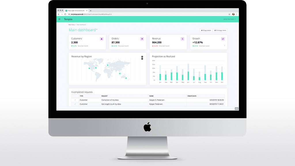
Dashboard design is a frequent request in application development these days. And for good reason. The present pace of business requires informed decisions and swift action. Business leaders dream about a simple view that presents relevant information, shows trends, points out potential risks and keeps employees up to date on what has happened, etc. This is where best practice dashboard design will help you deliver.
For me, a good dashboard – provides an at a glance preview of the information most essential to the user at the moment he or she is looking at it. This means that the context, should be taken into consideration when designing a business application dashboard, and it should provide an easy way to navigate directly to various points of importance relative to that context.
Define Your Purpose And Stay on Point
Like any other view in your application the dashboard design should be based on context and serve a specific purpose. And this purpose should guide your design decisions. It might sound obvious but getting this wrong will render your efforts meaningless when designing your dashboard. There are many opinions on how to categorize dashboards based on their purpose (analytical, strategic, operational, etc.) For the most part though, these two general types will be a good starting point.
Operational Dashboard
An Operational dashboard is about serving critical information to users engaged in time-sensitive tasks. Consequently, the main goals of the operational dashboard are to present deviations in data to the user quickly and clearly, and provide an overview of current resources and their present status. The dashboard is designed to help users act quickly, proactively and efficiently.
Dashboard Design Objective (operational):
- Time-sensitive
- Immediate action
- Easy navigation to critical details
Analytical Dashboard
In contrast to the Operational dashboard, an Analytical dashboard provides the user with at-a-glance information as a basis for analysis and decision making. The Analytical dashboard is less time-sensitive and not focused on immediacy. Rather it should be designed to help users make the best sense of the data at hand, enabling them to analyze trends and support informed decision making.
Dashboard Design Objective (analytical):
- Longer time periods
- Trends and analytics
- Digital report
The type of dashboard to implement in your application should be determined by the context of the user – often defined by the user’s role. An application may serve multiple purposes and will therefore often require dashboards designed for each of these. High level managers may need analytical dashboards whereas lower tier managers and other users may be better served by a more operational dashboard.
Standard software tends to mix the two in order to assume relevance to a wider audience. However, this may contradict the actual needs of the user, providing employees that are supposed to respond quickly to particular events with a ton of less valuable analytics. And vice-a-versa provide top management with a level of detail that will likely clutter the bigger picture.
Representation of Data
Dashboards are essentially a combination of charts, compound lists, and standout representations of particular record values. Choosing the right data representation is both complex and crucial to the expedience and value of the dashboard. Data representation is in part a cultural thing and therefore you should consider how different types of data is usually represented in your organization before committing to your dashboard design. If you are starting from scratch, here are some suggestions based on what users need to see.
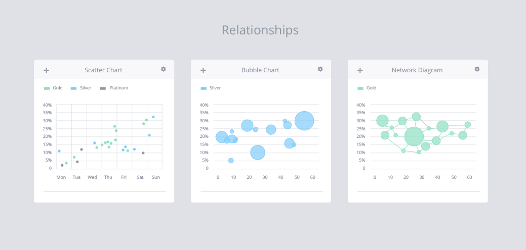
Relationships
- Scatter chart
- Bubble chart
- Network diagram
Scatter charts are useful for correlation and distribution analysis. Bubble charts help introduce the third dimension into the chart. A network diagram is advisable when even the slightest connection between data points are of importance.
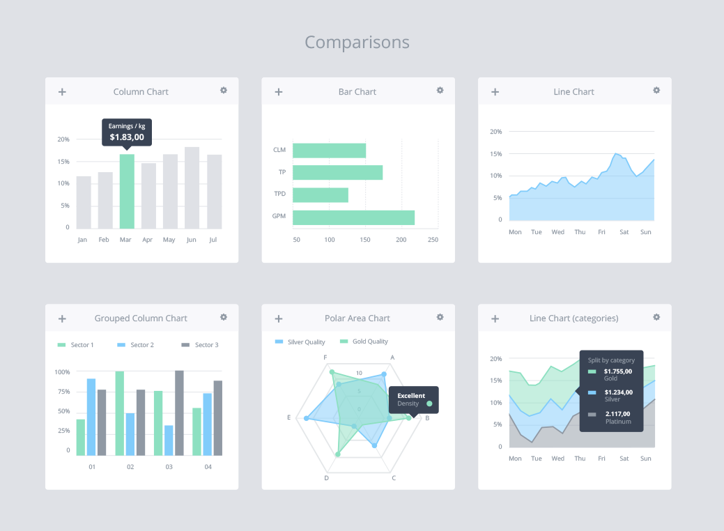
Comparisons
- Column chart
- Bar chart
- Line chart
- Grouped Column Chart
- Polar Area Chart
- Line chart (categories)
Using data visualizations to compare one or more value sets is much easier than looking at numbers in a table. Column and line charts are probably the most popular. Here are a few things to keep in mind when selecting the most suitable data representation. When one of your dimensions is time, it should be on the X axis as time in charts flows from left to right. When using a horizontal or vertical bar chart, try sorting columns by the greatest value rather than randomly sorting them. When using line graphs, try not to display more than five values to keep the visualization crisp, and when using bar charts, it is recommended to display no more than seven values to ensure clarity.
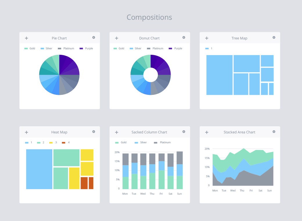
Compositions
- Pie Chart
- Donut Chart
- Tree Map
- Heat Map
- Stacked Column Chart
- Stacked Area Chart
Pie and Donut charts have a somewhat bad reputation in data visualization. These charts are among the most frequently used, but also the most frequently misused charts in the visualization toolbox. They are quite difficult to read, especially when several components are included sharing very similar values. Basically the human brain has a hard time differentiating values based on angles and fields, and combining the two makes it that much harder.
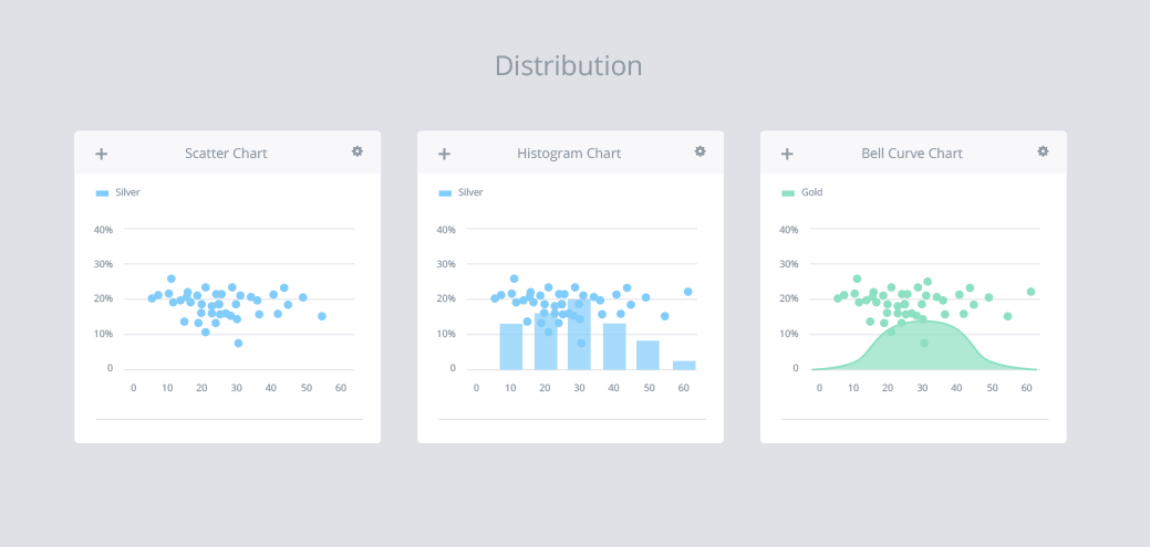
Distribution
- Scatter Chart
- Histogram Chart
- Bell Curve Chart
Distribution charts can help you illustrate deviations, normal tendencies, and the range of information in your data values. In order to select the most suitable data representation it can be helpful to ask yourself these simple questions:
- How many variables do you want to show in a single chart?
- Do you want to display values over a period of time, or among items/groups?
- How many data points are needed to display each variable?
Consistent Naming Conventions
Follow clear and consistent naming conventions. Use consistent date formatting throughout your application including your dashboards. Truncate large values, making them easier to read. Since the main goal of the dashboard is to get the right message across at a glance, every little detail counts. Perhaps the greatest benefit of using a clear and concise framework is data consistency. If your data is named the same way in each of your applications, it will be much easier for users to dive in.
Layout Grids
Using grids can help you achieve effective alignment and consistency with less effort and establish an intuitive structure for your design. Grids are basically “invisible” lines to guide the placement of elements. They help support the composition of the dashboard in a rational and structured fashion, which is important when organizing a lot of information within a limited space.
When making decisions on the hierarchy of information remember that the top left corner of the screen will get the most attention so try to position key info from left to right. When readers finish with the first row, they will naturally move down to the next section – comic book style.
If dashboard elements are interdependent make sure to establish a natural flow from one data visualization to the next so that the users won’t have to go back and forth in order to grasp the message.
Consistent Structure
Once the grid has been defined you can start working on the widgets that will hold the information, charts, and table elements. Aim for widget containers that offer a healthy dose of flexibility. Cards for instance, support a wide variety of content and are easily aligned using a grid. The most important thing about cards is that they are highly manipulatable and a good choice for responsive design. This means that you can design and deploy for any device using the same code base.
Another advantage of cards is the consistent layout of controls and data inside the container. Place the name in the top left corner or center and align view settings or actions to the top right corner, leaving plenty of real estate for the actual content. When all elements have a consistent structure, it’s much easier for the users to obtain a quick overview and work with the interface.
Using these layout principals have additional benefits of flexibility when it comes to responsive design and customization. While cards scale relative to the screen size, all main components remain anchored to specific locations. This is also beneficial for developers.
Generous Use of White Space
White space, or negative space, is the area between elements in a design composition. Developers aren’t usually aware of the importance of the negative space, but designers pay a lot of attention to it. And for good reason. If the white space is absent or unbalanced, legibility suffers, structure is lost and ultimately your end up with a terrible user experience. Don’t get caught up in widget-mania, trying to cramp in as much information as possibly can. Remember the purpose and display only the elements that will actually serve it.
Personalization rather than customization
Generally users expect that the content they see will be relevant to their individual needs. Personalization and customization are techniques that can help you ensure that users see what matters to them.
Personalization is usually done by the system itself. Preferably the application should be set to identify users and deliver the content, experience and functionality that matches their role.
Offering users the power to customize dashboard elements may seem like a charming idea. More often than not however, it is simply an excuse for not having put in the effort in the first place of finding out what each user group truly needs to see in order to work effectively.
Use Tables with Confidence
When integrating data tables or lists, make sure they offer interaction, allowing the user to access the full data set and underlying records. A data table is a great solution when you need to display a lot of information for a large number of items. They make great use of space and responsive tables allow for high data volumes even on small devices. From a developer point of view they also make a lot of sense, and users are typically comfortable working with grids as most people are accustomed to working with spreadsheets.
Patience will be rewarded
Since the dashboard is one of the most visually exciting views in an application, it is often one of the first things that designers and developers focus on. I would recommend however, that you resist the temptation and do the opposite. At its best a dashboard is a summary view of the most important information in the application relative to the context of the user. It draws upon data from various parts of the application in an attempt to filter and extract the essence. Therefore, it is much more practical to design the dashboard at the end of the application development process, and since it will yield much better results your patience will be rewarded.